 |
|||
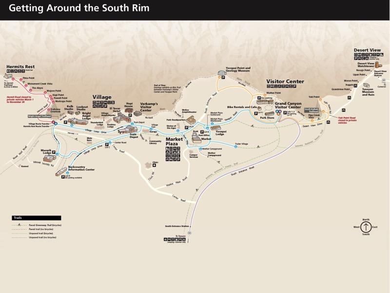
Labels bring meaning to a map. The map labels are in Frutiger, the house font for National Park Service maps. To facilitate more efficient reading, I prefer direct-labeling map locations over identifying them with numbers and bullet lists. Varying the size and weight of labels and positioning them with symbol clusters created visual hierarchies. I took steps to improve legibility. The dark labels contrast against the light map background. The main visitor destinations are large, ranging from 8 to 16 points. And to accommodate readers with red-green color blindness, I did not use green type to avoid confusion with the red notes. |
||