Making 3D Terrain Maps |
||||||||||
--Type |
||||||||||
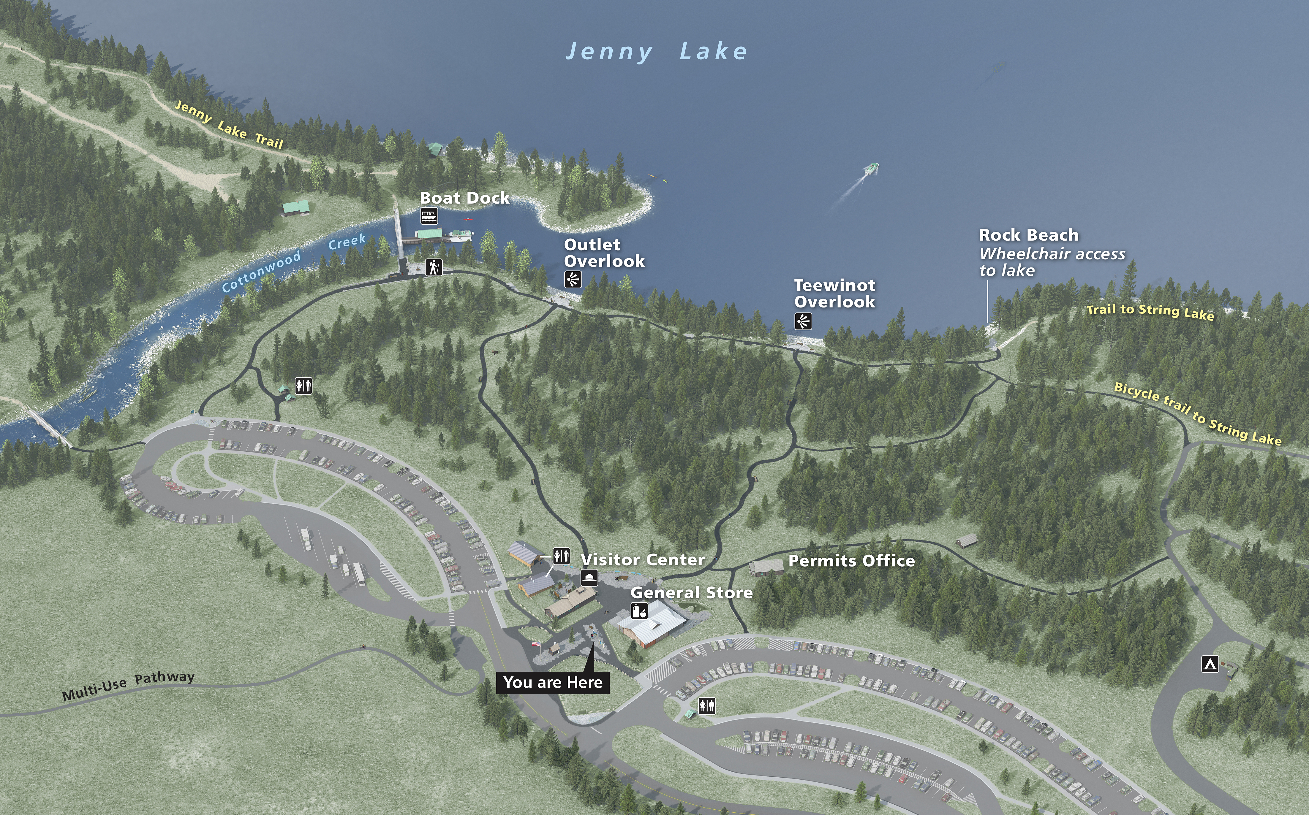
It is fitting to end this series by discussing the task that I do last on a 3D terrain map project: placing type. After arduous 3D work—the Jenny Lake Visitor Center map below took 6 months to complete and 9 continuous days to render the final scene—type placement by comparison goes blazingly fast. An important transformation also happens. With labels, the 3D image becomes more than just a collection of pleasantly arranged pixels. It conveys information and meaning to readers. It is now a map. I recently placed labels on the two maps below, which are for outdoor exhibits at Jenny Lake in Grand Teton National Park. Labeling the first map, viewed from a high-oblique elevation, was much like labeling a conventional map. I took care when placing type and symbols not to cover up points of interest, such as buildings, the boat dock, and overlooks. Because the image is relatively dark throughout, I decided to use mostly white, yellow, and pale blue labels set in a semi-bold font and accented with drop shadows. Only in the lighter open area in the lower left do I use a black label. |
||||||||||
 |
||||||||||
Jenny Lake Visitor Center, Grand Teton National Park, Wyoming. Base map art by Tim Montenyohl, International Mapping. (Click map to enlarge.) |
||||||||||
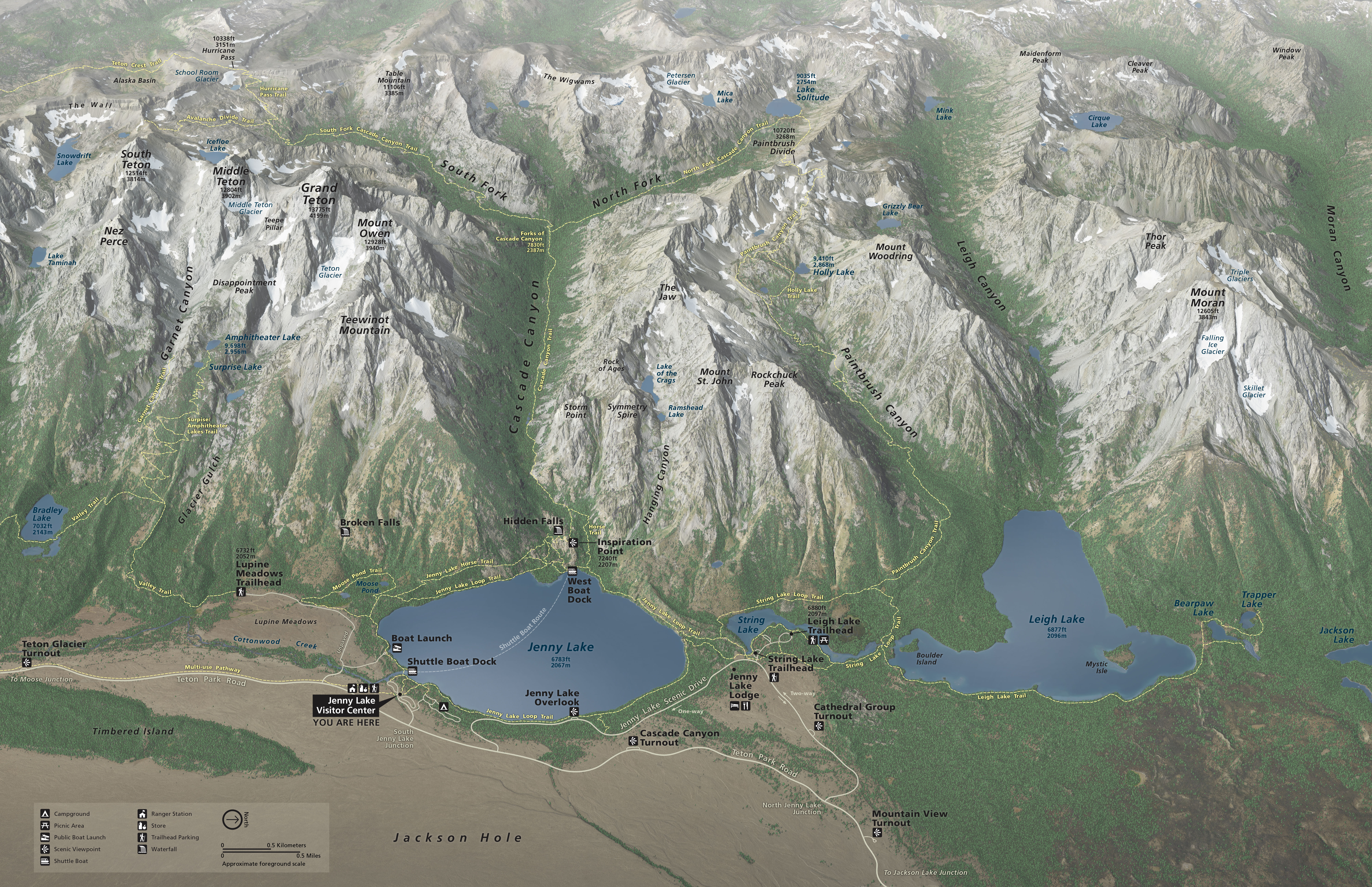
The second map for hikers shown below was a typographic challenge. The contrasting and juxtaposed mountain textures ranging from white glaciers and snow patches to dark cast shadows interfered with type legibility. I used a couple of tricks to ameliorate this problem. The black type is comprised of 100% black, 100% cyan, 100% magenta, and 100% yellow to make it as dense as possible. Behind the type I blurred and lightened the terrain image with a feathered selection, taking pains not to make the halo effect too pronounced. The cure should not be worse than the disease. A second problem was deciding where to place mountain names and elevations. Placing the labels at the summits would have obscured a most interesting part of the map. I compromised by moving the labels down slope to positions where they would do the least harm. This map has a north arrow and scale, which cartographic purists might find objectionable. Because of perspective built into the view, true north varies slightly from side to side. I decided that it was more important to give visitors a general inkling of north rather than to leave them wondering. The same thinking applies for the bar scale. The accompanying note "approximate foreground scale" informs visitors of its limitations. |
||||||||||
 |
||||||||||
Jenny Lake Hiking Map, Grand Teton National Park, Wyoming. (Click map to enlarge.) |
||||||||||
 |
||||||||||