Making 3D Terrain Maps |
||||||||||||
--Natural Color |
||||||||||||
Most of my 3D terrain maps have one thing in common: natural colors—the hues and tones that we see in the real-world that I use to color terrain on maps. The idea for natural color maps started in the 1950s with US Geological Survey cartographer and amateur landscape painter, Hal Shelton, who painted relief art for a series of freelance maps showing airline routes. His reasoning was simple: for airline passengers to better relate the map they were holding in their hands to the land below, the colors should match. For example, on his maps, arid lands are brown, forested regions are green, high mountains are white, etc. Back then, Shelton's advocacy of natural colors on maps was a radical idea. But nowadays it seems like, well, the natural thing to do. |
||||||||||||
 |
||||||||||||
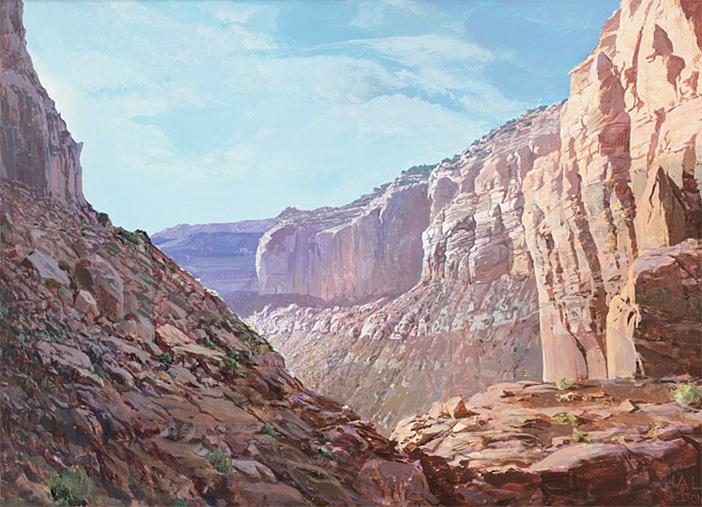
A Colorado Plateau landscape by Hal Shelton. Shelton's art experience inspired how he made maps. Source: halshelton.com. |
||||||||||||
There are several ways to apply natural colors to terrains in Natural Designer Pro. Draping satellite images or land cover data is a common method that I will discuss separately on the next page. There are also these other methods to produce natural color maps, which are often simple and effective: Feature Colors – In the Settings/Terrain window, selecting "Features" as the terrain coloring method will render soil, grass, rock, and snow textures based on elevation. These default colors work best for mountain environments that emerge above tree line, such as this Crater Lake scene shown previously. Blend Colors – Alternatively, in the Settings/Terrain window, you could select "Blend Colors" as the terrain coloring method to apply hypsometric tints that mimic natural terrain colors. For example, the default "Atlas II " palette derives from Swiss topographic map colors, which progress upwards from dark green (forested) lowlands to yellow-green (meadows) mid elevations to white (snowy) highlands. Alternatively, the "Brown" palette is suitable for arid lands. Photoshop – You can also create natural colors in Photoshop from basic grayscale terrain renders. To demonstrate this method, I will discuss the Grand Canyon map below that derives from three items rendered in Natural Scene Designer Pro: a gray 3D terrain, a 3D terrain draped with gray texture shading, and a height mask. |
||||||||||||
 |
||||||||||||
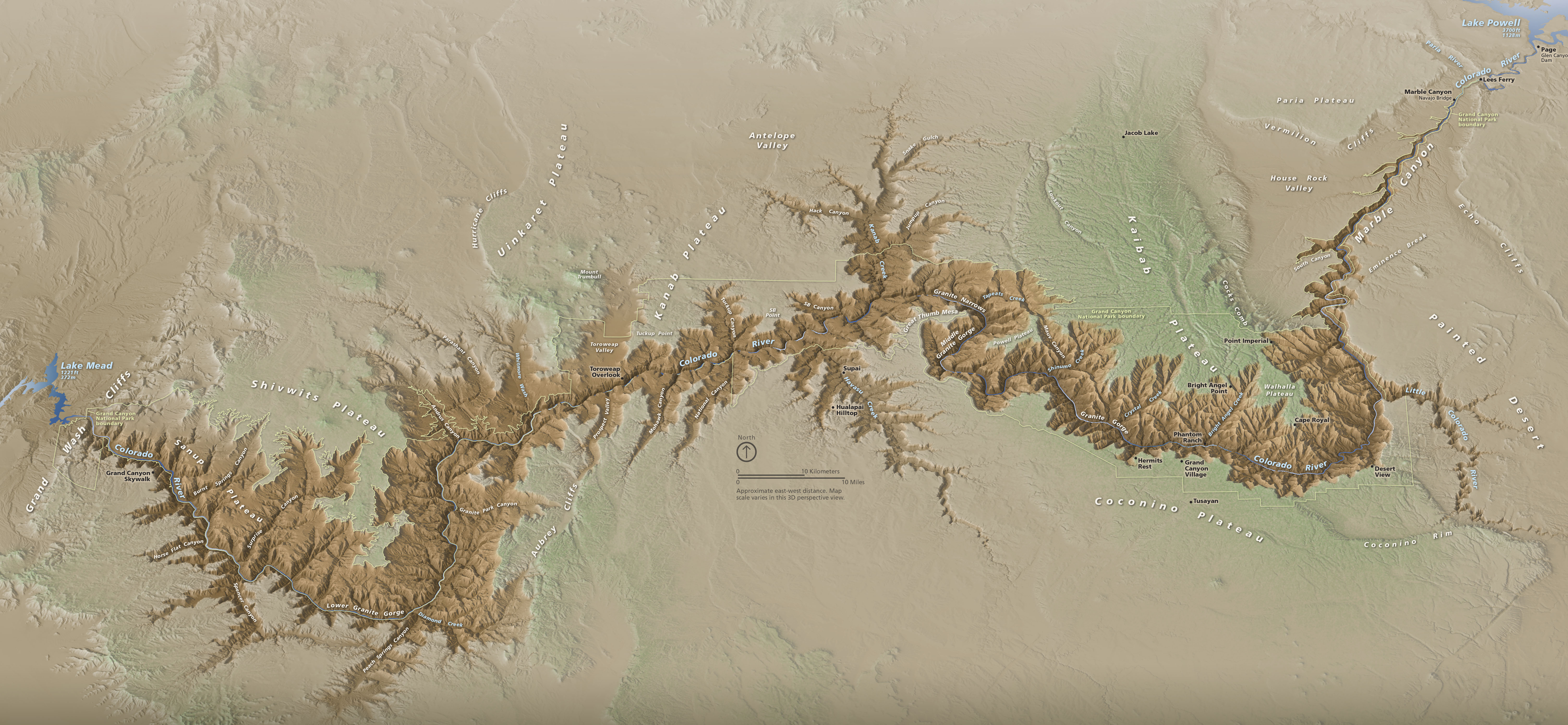
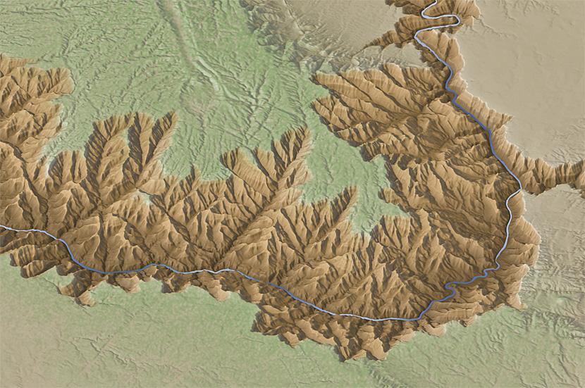
Grand Canyon National Park, Arizona. (Click map to enlarge.) |
||||||||||||
Step-by-step procedure The following images and captions summarize how I created a natural color map of the Grand Canyon. |
||||||||||||
 |
||||||||||||
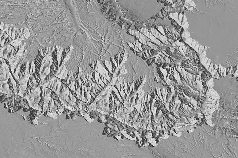
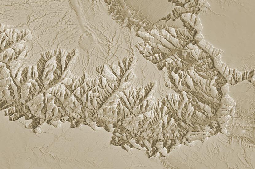
1) In Natural Scene Designer Pro, I started by rendering the terrain as a simple grayscale relief. I used 15% gray as the palette (Settings/Terrain/Blend Colors). The light direction is mainly from the southwest, but I also used multiple lights to better depict some of the side canyons. |
||||||||||||
 |
||||||||||||
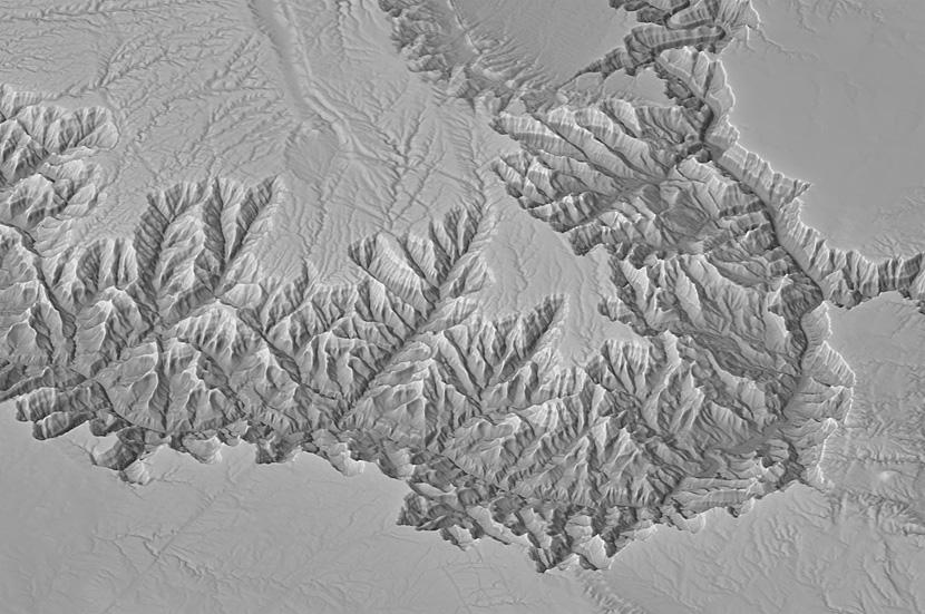
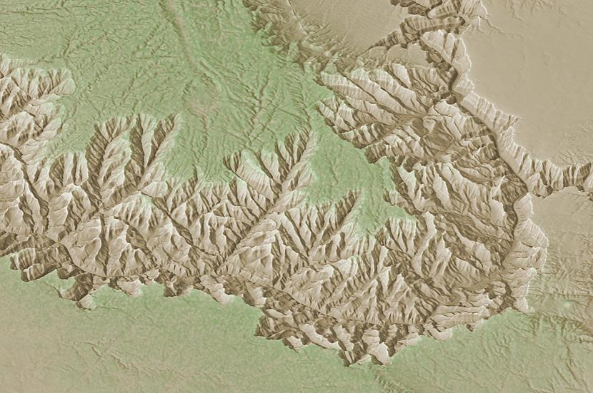
2) This image actually represents three steps. First, I rendered a texture shading in Natural Scene Designer Pro using the default settings (Render/Render Texture Shade). Second, I draped the Texture Shade image (Overlays/Import Image and Scale to Fit) on the Grand Canyon terrain and rendered it in 3D (Render/Render Picture). Third, in Photoshop, I blended 3D texture shade with the 3D grayscale relief (see image 1). Using normal blending mode, the proportions are 40% texture shading to 60% grayscale relief. The addition of texture shading reveals the canyon rims and ledges. |
||||||||||||
 |
||||||||||||
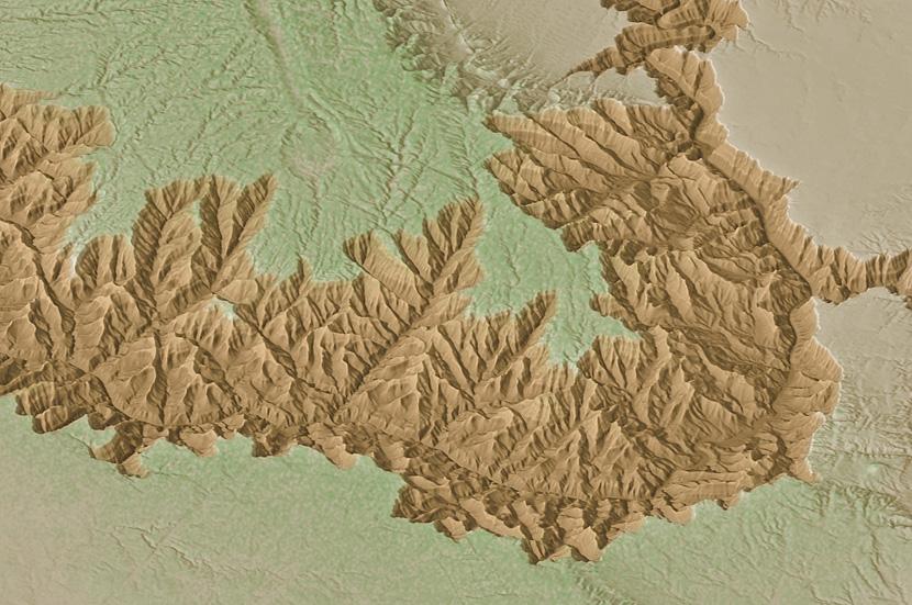
3) In Photoshop, I tinted the terrain brown using a Hue/Saturation adjustment (Image/Adjustments/Hue/Saturation). With the colorize button checked, I specified these settings: Hue = 40, Saturation = 20, Lightness = 0. This resulted in a generic arid-land color. |
||||||||||||
 |
||||||||||||
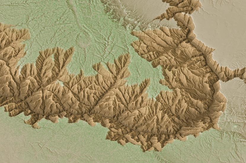
4) Forests cover the high plateaus adjacent to the arid interior of the Grand Canyon. To apply a green forest tint to these uplands, in Photoshop, I used the height mask rendered in Natural Scene Designer Pro. On the height mask higher areas are lighter, which prints more green in these areas, reflecting the denser forests that occur with increasing elevation. For impressionistic purposes, I applied a slight stipple pattern to suggest forest canopy, even though at this map scale individual trees are not visible. |
||||||||||||
 |
||||||||||||
5) The red tint inside the Grand Canyon is the crux of the map—with it the Grand Canyon comes into clear focus. To apply red only to areas below the canyon rims, which vary in elevation, I spent six hours drawing a selection with the Lasso Tool that enclosed the entire canyon. Next, when I created a Hue/Saturation adjustment layer to tint the canyon red, this selection automatically became a layer mask. To lessen the abrupt transition to red at the canyon rims, I applied a slight amount of blur to the layer mask (Filter/Blur/Gaussian Blur). |
||||||||||||
 |
||||||||||||
6) To emphasize the depth of the Grand Canyon, I placed a duplicate copy of the height mask on a layer above the relief image. Choking back the tonal range (Image/Adjustment/Curves) and specifying Multiply blending mode for this layer darkened only the lowest elevations. Besides emphasizing depth, the dark lowland tones indicate the different geology in Grand Canyon's Inner Gorge. Here, the bright sedimentary rocks give way to foreboding Vishnu schist dating from Precambrian time. |
||||||||||||
 |
||||||||||||
7) To finish, I added the all-important Colorado River—why the Grand Canyon exists in the first place—adorned with sun glints. I also added illumination highlights (made with a duplicate of the relief image shown in step 1) to the canyon rims and topography on the plateau surfaces. |
||||||||||||
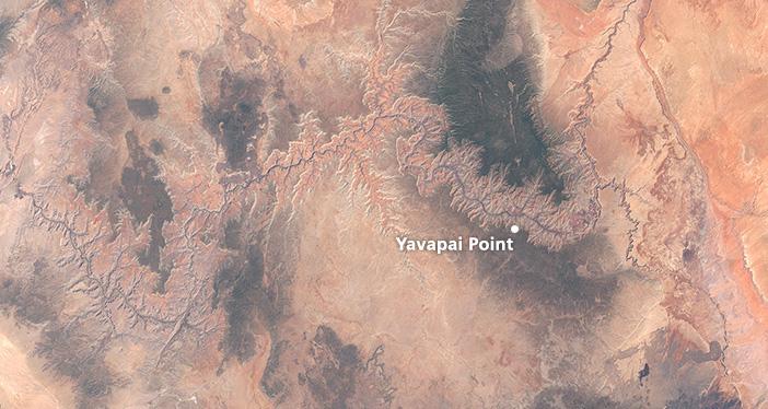
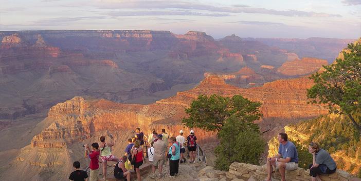
Selecting natural colors Some of you are probably thinking: to create natural colors, instead of the elaborate process just described, why not just drape an aerial image on the terrain? That way you get the real thing. Which is often the problem. Aerial photographs and satellite images can differ from how we see a landscape when we are there. Consider the two Grand Canyon images below, one is a "natural color" Landsat image and the other is a tourist snapshot from the South Rim. The canyon is drab on the Landsat image compared to the snapshot. In addition, the forested plateaus are distractingly dark. Natural color maps should ideally reflect what people on the ground see. Even then, it is sometimes necessary to depart from observed reality to produce a more readable map. For example, my map of the Grand Canyons shows the Colorado River as blue instead of its true muddy color, which would blend in with the terrain. |
||||||||||||
 |
||||||||||||
A Landsat 8 image of Grand Canyon created from bands 4, 3, and 2. |
||||||||||||
 |
||||||||||||
A sunset gathering at Yavapai Point, South Rim. |
||||||||||||
 |
||||||||||||