Making 3D Terrain Maps |
||||||||||
--Should you make a 3D map? |
||||||||||
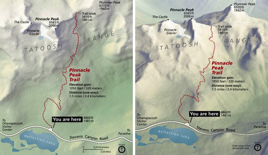
There are good reasons for making 3D terrain maps: they look interesting, attracting the attention of readers. Oblique viewed terrain that is three-dimensional is easier for general audiences to understand compared to conventional shaded relief and certainly topographic maps packed with contour lines. They show the vertical dimension of a landscape in addition to the x, y spatial dimension (see maps below). It is also immensely satisfying to make 3D terrain maps. |
||||||||||
 |
||||||||||
A 2D map (left) and 3D map (right) of Pinnacle Peak, Mount Rainier National Park, Washington. |
||||||||||
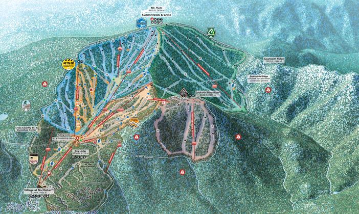
Despite offering real advantages, for most projects you should NOT bother making a 3D map. These are prohibiting factors to consider: Time – Producing a 3D terrain map takes from two to three times as long as a conventional map. You must first compile a 2D base map before rendering the elements in 3D. There are a great many design variables to account for: For example, will the terrain look better with slightly more vertical exaggeration? Designing 3D terrain maps is addictive. You can experiment for hours. Cost – Directly related to the above. Data – Mapping is not possible without essential data, such as DEMs and aerial imagery. Other data challenges include low resolution, poor quality, and compatibility—especially maps that straddle international borders. You can spend large amounts of time trying to enhance poor quality data and still end up with a map that looks bad. Geography – Some terrain is not suited for 3D depiction. Such as when important features stay hidden regardless of the viewing direction. Or when the focus of the map is a boring area dominated by adjacent terrain that is more interesting. For example, on a 3D terrain map of the Coconino Plateau, Arizona, most of us would instead look at nearby Grand Canyon. Purpose/audience – Serious backcountry users need topographic maps with contour lines (although 3D maps are useful for trip planning). If terrain is not an essential part of your map's message, going to the trouble of making a 3D map makes little sense. Georeferencing – 3D terrain maps are pictorial products without georeferencing. On a mobile device there is no pulsing blue dot showing where you are. Point of view – 3D terrain maps have a single point of view (see map below). Unlike a conventional map, it is not possible to navigate with a 3D map rotated 180 degrees. The mountains are upside down. |
||||||||||
 |
||||||||||
Northstar-at-Tahoe ski area digitally rendered by Alex Tait. 3D ski area maps do a good job orienting skiers facing upslope. Downhill navigation, however, is difficult because of the reverse orientation. Skiers must follow posted trail signs to get down. |
||||||||||
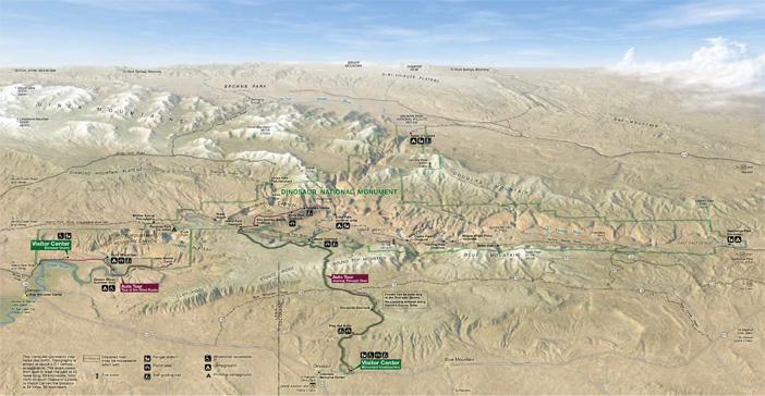
Foreshortening – The vertical dimension (from top to bottom on a page) of a 3D map is shorter than a conventional map of the same area because of the oblique viewing angle. The viewable area compresses. This is bad if your map must show important features in the background, or give equal emphasis to foreground and background features. Also, if your 3D terrain map must go in a layout with a portrait format, the fit can be awkward. In the 1990s, with newfound enthusiasm for 3D digital techniques, I made a map of Dinosaur National Monument that I would come to regret (see map below). Among the problems: most of the map foreground was non-park land. In the middle ground, foreshortening compressed the already narrow main park area on the north-south (vertical) axis. As a consequence, the Green and Yampa rivers are mostly obscured in their deep canyons. Lastly, the sky and clouds devote too much precious map real estate to what is essentially a decorative element (see: Sky or no sky?). Two years later for a reprint of the brochure, I swapped in a more functional, albeit less interesting, 2D map of Dinosaur National Monument. Lesson learned: I now wait for the right 3D mapping project to come along. |
||||||||||
 |
||||||||||
Dinosaur National Monument, Utah. (Click map to enlarge.) |
||||||||||
 |
||||||||||