


Map basics
Data sources and manipulation
Plan oblique relief
Hypsometric tints
Tips and comments
Projection: Albers Equal-Area Conic, standard parallels 29.5 N and 45.5 N, central meridian 96 W
Datum: NAD83
Scale: 1:4,000,000
Size: 50 inches wide x 35 inches high
Raster resolution: 250 dpi, 12,500 x 8,750 pixels
Elevation data resolution: 700 meters
File format: JPEG (quality setting 10)
Color mode: RGB (embedded color profile - Adobe RGB 1998)
Fonts: Adobe Frutiger Light Italic (46) and Roman (55)
Data sources and manipulation
Coasts, drainages, and boundaries – 1:2 million-scale Digital Chart of the World (DCW) obtained from the Pennsylvania State University Libraries. Starting with voluminous raw DCW data, creating presentable hydrography for the map was by far the most time-consuming production task. Initial manipulations included map reprojection using MAPublisher 6.2 (running as a plugin in Adobe Illustrator CS2), deleting unwanted lakes and rivers, ranking the rivers by size, and tapering their widths. The manipulated hydrography (and other map lines) contained the same number of vector data points as the original DCW data.
Next, the manipulated DCW lines were rasterized in Photoshop CS2, saved as TIF files, and rendered in Natural Scene Designer Pro 5.0 as draped images on the terrain surface of the coterminous United States. The rendered lines were then touched up by hand in Photoshop primarily to improve registration. Finally, in Photoshop, the lines were composited with the underlying terrain and the file flattened to produce the final map. Because the map linework underwent significant transformations when converted from vectors to rendered raster final, the final map has a much softer appearance than the original DCW data.
Terrestrial elevation data – 3-arc second Shuttle Radar Topography Mission (SRTM) data obtained from Natural Graphics and downsampled to 700-meter resolution. Data voids were filled with National Elevation Dataset in the coterminous United States and GTOPO30 elsewhere. The technique for filling the voids was the same as that used for creating CleanTOPO2, described here.
Other data manipulation includes resolution bumping applied to all high mountains in the western U.S., a small amount of selective vertical exaggeration applied to the central Rocky Mountains and Black Hills, and smoothing applied globally. Without smoothing applied to the elevation data the rendered terrain would have a harsh, noisy appearance, especially the rugged mountains of the northern Rockies and northern Cascade Range. On the final map, flat lands contain more detail than do the mountains.
The volcanic summits of the Cascade Range received manual touchups in Photoshop. Adding a couple of pixels to the width of upper-elevation slopes gave the peaks more bulk and a more familiar appearance. Looking at the final map suggests that Mt. Rainier could have used additional manual touchups to broaden its distinctive summit. Mt. Shasta near the southern end of the Cascade Range in California did not require touchups.
Bathymetry – 5km CleanTOPO2 data colorized in Adobe Photoshop as a 16-bit RGB TIF file and then liberally smoothed with Gaussian Blur. Working with 16-bit data and applying a small amount of Gaussian Noise to the smoothed bathymetry prevented banding in the softly-modulated blue tones. The final step was to convert the 16-bit bathymetry to an 8-bit image and combine it with the final map in Photoshop.
Labels – The USGS National Atlas team generously provided 90 percent of the labels and spot elevations found on the Physical Map of the Coterminous United States. Concurrent with the production of the Physical Map of the Coterminous United States, the USGS was producing a physical features map for the National Atlas series, which also used Adobe Illustrator and the Albers Equal-Area Conic Projection as the foundation for production. Transferring the USGS labels was a simple matter of copying and pasting between the open Adobe Illustrator files.
Because the Physical Map of the Coterminous United States portrays terrain in 3D compared to the 2D shaded relief on the USGS map, repositioning labels and elevation points in mountainous regions was necessary. In addition, the USGS map labels aligned to the curved graticule of the Albers Equal-Area Projection. Rotate Text, a freeware filter from Graffix, proved a huge time saver for converting the labels to a horizontal alignment.
Plan oblique relief
The Physical Map of the Coterminous United States uses plan oblique relief, a new technique for rendering terrain from digital elevation models (DEMs). Plan oblique relief portrays landforms—peaks, mesas, canyons, escarpments, etc.—with pronounced three-dimensionality. The assumption is that plan oblique relief on small-scale maps is easier for general audiences to read than conventional shaded relief.
Plan oblique relief contains the characteristics of both conventional shaded relief and 3D perspective views. As the "plan" in its name suggests, plan oblique relief uses a planimetric base just as most shaded relief maps do. The “oblique” in its name refers to the shallow angle used for rendering the terrain. On shaded relief maps, terrain rendering occurs from a theoretical vantage point directly overhead. Plan oblique relief uses a lower vantage point, somewhere between the zenith (90 degrees) and the southern horizon (0 degrees) on north-oriented maps. This results in 3D terrain that projects upwards perpendicular from the bottom of the map and parallel to the reader's view. The effect is not unlike axonometric city maps, but with three-dimensionality applied not to buildings but to the terrain.
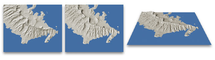
Southeast Oahu, Hawaii, depicted with conventional shaded relief (left), plan oblique relief (middle), and as a 3D perspective view (right). For a pop-up enlargement of the illustration click here.
Erwin Raisz (1893–1968)
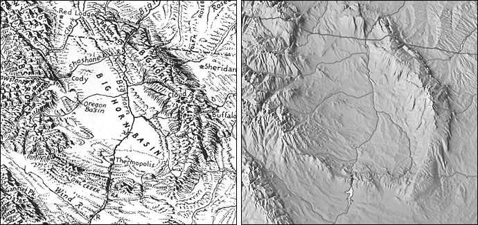
The landform maps drawn by Harvard Professor Erwin Raisz a half-century ago, which are still available today, serve as the inspiration for using plan oblique relief. Using only a pen, aerial photography and topographic map references and his considerable knowledge of physical geography, Raisz depicted landforms with 50 classes of pictorial symbology. With only a few expertly placed strokes of the pen Raisz captured the look of complex physical features. His maps are in essence caricatures, but with the landscape as the subject matter and accuracy a key consideration. The Physical Map of the Coterminous United States attempts to portray landforms in a manner similar to that of Raisz, although with continuous tones instead of inked lines.
An alpha version of Natural Scene Designer Pro 5.0 (NSD Pro 5.0) generated the plan oblique relief found in the Physical Map of the Coterminous United States. (Purhasers of NSD 4 after Oct. 11, 2006 qualify for a free upgrade to NSD 5. Anticipated release date: spring 2007). Up until now, creating plan oblique relief with digital data and software has been difficult. A previous technique developed by the author and based on Bryce and Photoshop software proved cumbersome to use, yielded maps that were not completely planimetric, and the render quality was poor. By comparison, NSD Pro 5.0 generates completely planimetric terrain at a uniform resolution and with high render quality.
Creating plan oblique relief with NSD Pro 5.0 is simple. It involves:
1. Opening a DEM.
2. Selecting the "Render Planimetric Oblique Relief" from the Render drop menu (NSD Pro 5.0 uses a slightly different name for plan oblique relief).
3. Clicking the render button.
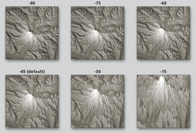
The default settings in NSD Pro 5.0 produce excellent plan oblique relief in most cases. Rendering the Physical Map of the Coterminous United States, however, required minor modifications to the default settings. Click here to see the dialog for rendering planimetric oblique relief in NSD 5.0.
Pitch – The pitch setting received a value of negative 35 instead of negative 45 to exaggerate the height of landforms—a necessity because of the small scale (1:4 million) and intended viewing distance of the wall map from several feet away. Because plan oblique relief is always constrained to planimetric proportions regardless of the position of the virtual camera, setting the pitch at a shallower angle forces the terrain to appear higher (and more three dimensional) when rendered.
Light settings – Rotating the illumination azimuth from 225 degrees (southwest) to 255 degrees (west southwest) was also necessary. Doing this more closely matched the northwest illumination of conventional shaded relief, giving the map a more familiar look. (Plan oblique relief and conventional shaded relief appear similar on small-scale maps in areas with gentle terrain.) Another factor was the many north-south trending mountains found in the U.S., which illumination originating in the west portrays more dramatically than does illumination from the southwest.
Note: because plan oblique relief is three-dimensional, conventional illumination from the northwest places shadows on slopes facing the reader that darken the map and decrease legibility. Illumination from the lower right (southeast on north-oriented maps) is not advised because relief inversion tends to occur.
Plan oblique relief—deciding on the name
The relief presentation technique described above goes by many names, most of which are technical, polysyllabic, and confusing. The simpler name “plan oblique relief” was first proposed in a 1978 article by Carlbom and Paciorek (see reference below) and pointed out to me by Bernhard Jenny, Institute of Cartography, ETH, Zurich.
Carlbom, I. and Paciorek, J. 1978. Planar geometric projections and viewing transformations, Computing Surveys, 10(4):465-502.
For more information on plan oblique relief refer to this paper presented by Bernhard Jenny at the 5th ICA Mountain Cartography Workshop at Bohinj, Slovenia.
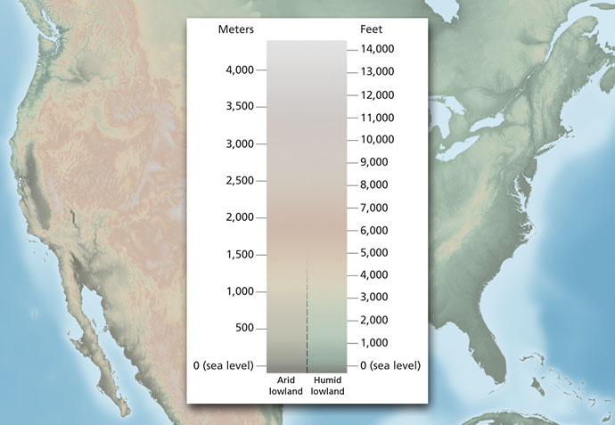
Hypsometric tints (elevation colors)
The hypsometric tints found on the Physical Map of the Coterminous United States are a modified version of those developed for the 1962 International Map of the World. A printed sample of these tints is available as a supplement in Eduard Imhof's 1982 text, Cartographic Relief Presentation. The International Map of the World hypsometric tints have the advantage of colors that are relatively natural and yet still distinct from one another. Distinct colors are a necessity for portraying the nearly 15,000-foot elevation range (Death Valley to Mt. Whitney) of the coterminous United States.
Yellow—where to put it?
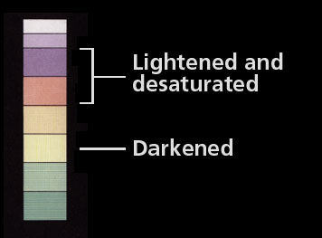
Modifications to the International Map of the World hypsometric tints were attempted to make the colors transition more evenly from dark to light in moving from lowlands to highlands. An even dark-to-light transition makes relative elevation differences easier to visualize on a map. The attractive light yellow sandwiched between the darker greens and reds proved a discordant color when implementing this value-based scheme. Darkening the yellow helped somewhat, but when darkened too much the yellow became neutral beige and the map looked dull.
To sidestep the light yellow problem, hypsometric tints were assigned to elevations as though the coterminous United States were two maps—the western United States, which is largely an elevated plateau interspersed by lofty mountain ranges and deep canyons, and the comparatively low and flat East. Light yellow acts as the bridge color occupying the middle ground between these distinct regions. Assigning yellow to approximately the 4,000-foot elevation placed it in the Great Plains near the base of the Rocky Mountains. Below this zone and to the east the yellow blends gradually into darker lowland greens; to the west the land rises sharply and the palette changes to reds and grays.
Coordinating with vegetation
A significant number of map readers mistakenly think that hypsometric tints represent vegetation. Acknowledging this inconvenient truth, the Physical Map of the Coterminous United States assigns colors to elevation zones with the secondary goal of closely matching reader perceptions about the vegetation (and overall environment) of geographic regions. For example, yellow is assigned to the elevation zone that corresponds to the western Great Plains where semi-arid grasslands are found, red to mid-elevations of the intermountain west that are largely arid, and gray and light gray to the highest mountains, where rock and ice predominate. In the high and dry Great Basin, the saline valleys that were once the bottom of ancient Lake Bonneville and Lake Lahontan appear lighter than the surrounding red uplands.
In contrast to the parched West, the East is entirely green and yellow-green except for a faint blush that crowns the highest elevations of the Appalachians. The darkest greens occupy the waterlogged lowlands that fringe the Atlantic and Gulf of Mexico coasts. In the U.S. heartland, the subtle elevation colors emphasize how the Mississippi River and its tributaries funnel water southward to the Gulf of Mexico. The hypsometric tints attempt to show tonal modulation for all regions, regardless of their flatness.
Cross-blended hypsometric tints
Working under an assumption that Amazonian green does not belong in Death Valley, the Physical Map of the Coterminous United States uses cross-blended hypsometric tints to swap olive brown for green in arid lowlands. The isohyet for 20 inches of annual precipitation served as the general boundary between humid and arid regions. Where humid and arid climates transition into one another, the lowlands are a blend of green and brown. If the humid-arid transition zone is wide, as in the Great Plains, so too is the color transition; in the Pacific Northwest, where humid lowlands are confined to a narrow coastal strip, the transition on the map is correspondingly abrupt. Except for those regions just mentioned, humid and arid lowlands are widely separated from one another by highlands in the coterminous United States and easy to delineate.
For more discussion of cross-blended hypsometric tints refer to this tutorial.
More on color
• Hypsometric and vegetation colors do not coordinate everywhere on the Physical Map of the Coterminous United States. For example, the forested mountains of the Rockies appear as light gray on the map instead of green. Despite widespread irrigated farming in the Central Valley of California, olive brown appears there. There is a limit to how much hypsometry and vegetation should be coordinated; if over applied, hypsometric tints will diminish in importance and land cover will become dominant, confusing the message of the map.
• The Physical Map of the Coterminous United States merges hypsometric tints with plan oblique relief. The intense illumination and shadows of the relief in high mountains largely obscure the elevation colors.
• Hypsometric tint intervals on the map do not correspond with indexed elevation values and neatly defined elevation zones, be they in feet or meters. The basis for assigning colors to elevations was conveying a general impression of relative elevations, coordinating with regional vegetation (where possible), and creating an attractive map. The legend on the map reflects this fall-where-they-may approach to assigning colors to elevations.
• The map legend shows hypsometric tints as a linear scale with equal elevation intervals, therefore the gray and white tints found at high elevations occupy significant space in the legend. On the map itself high elevations are comparatively rare, as are the colors that represent them.
• Perhaps the most important colors on the map are those most taken for granted—bathymetry colors. Without the cool, soothing blues of the water to act as a counterbalance, it would not be practical to use a warm palette for terrestrial areas. A critical color choice involved selecting a shade of blue to occupy shallow ocean waters and interior lakes. If too dark, the ocean shallows and adjacent terrestrial lowlands would merge, negating figure-ground. If too light, the land-water contact zone would exhibit jarring contrast and inland water bodies would appear drained of water. Another concern was selecting an appropriate blue to represent the deep ocean basins. To prevent drawing attention away from terrestrial areas—the primary focus of the map—deep oceans are represented with a de-saturated medium blue. Smoothing the bathymetric detail also helped relegate it to the background.
• Manipulating the drainages to appear with consistent contrast against a changing backdrop of hypsometric tints was a challenge. The unaltered drainages had a value similar to green and brown lowland tints, making them difficult to see. To solve this problem, the drainages were made gradually darker as they descend from highlands to lowlands. An Adjustment Layer in Photoshop that contained the inverted hypsometric tints in a Layer Mask, to modulate the darkness of the drainages, accomplished this.
Tips and comments
Enlargement and reduction – The optimal printing size for the Physical Map of the Coterminous United States is 50 inches wide x 35 inches high at 250 DPI. Because the map is entirely raster, if enlarged too much the type and lines will appear fuzzy and indistinct. Drainages are especially prone to appearing soft-edged when enlarged. The type and lines look crisper when reduced. However, when reduced to less than 75 percent of original size, the type and terrain on the map begin to appear too small.
Color adjustments – Even though the map is a single-layer Photoshop file, changing the colors is easily done. Use the Levels dialog (Image/Adjustments/Levels) to lighten or darken the entire image—dragging the gamma control to the left lightens the image and to the right darkens it. Dramatic changes in image density are possible with only small adjustments to the levels settings.
To make significant changes to the hue and saturation of the map colors, use the Photoshop dialogs for Replace Color (Image/Adjustments/Replace Color) and Selective Color (Image/Adjustments/Selective Color). The only thing you can not do is change the elevation range of the colors.
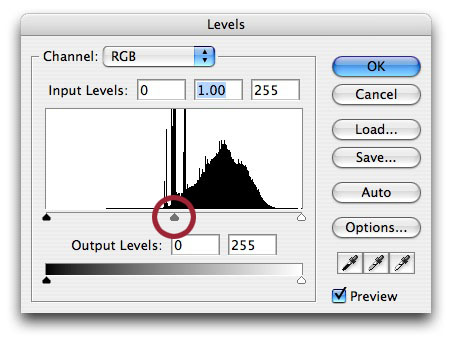
Levels dialog. Sliding the Gamma control (circled in red) adjusts the lightness and darkness of midtone colors.
Hypsometric tint specs – To obtain precise values for the hypsometric tints in the Physical Map of the Coterminous United States, use the Eye-dropper tool in Photoshop to sample colors in the legend. Because the legend does not contain shaded relief, the elevation colors are purer there than elsewhere on the map.
Removing raster labels – In Photoshop copy and paste Wall Map 2, which has no labels, on a layer below Wall map 1, which does have labels. Then, on the layer containing Wall Map 1, use the eraser tool or paint on a layer mask to let the unlabeled terrain below show through.
Darker boundaries – In Photoshop, copy and paste the extra boundary file (available as a separate download) on a new layer above the layer containing the Physical Map of the Coterminous United States. Changing the blending mode of the layer to Multiply and adjusting the layer's opacity will result in darker lines.
Creating a floating USA – In Photoshop, invert the USA mask file (available as a separate download) and copy and paste it into a layer mask containing the Physical Map of the Coterminous United States.
Plan oblique relief, because it is three-dimensional, places the following limitations on how the map may be used:
Overlaying lines – Lines obtained from other maps with the same projection parameters as the Physical Map of the Coterminous United States will only register with it at sea level. With increasing or decreasing elevation from sea level the added lines and terrain below will become more misaligned.
Rotating the map – The 3D terrain projects upwards perpendicular to the bottom of the map. Tilting the vertical axis of the relief ruins its effectiveness. For example, cropping and rotating the map to show, say, California with north orientation would tilt the Sierra Nevada oddly to the west.
Reprojection – For the above reasons, do this only if you want to create abstract art rather than a map.
What you should do with the map:
Use it as a reference—perhaps you will discover a surprising new terrain feature.
Return to Shadedrelief.com